Exposure Fusion – Local Tonemapping for Real-Time Rendering
来源:https://bartwronski.com/2022/02/28/exposure-fusion-local-tonemapping-for-real-time-rendering/ 摘录时间:2026-08-19 作者:Bart Wronski 发布时间:2022-02-28
摘要(Key Takeaways)
- 主题:介绍 Exposure Fusion 算法在实时渲染中实现局部色调映射(Local Tonemapping, LTM)的原理、实现与参数调优
- 核心结论 / 关键要点:
- 全局色调映射无法同时保留高动态范围场景中亮部和暗部的细节,局部色调映射是物理管线中几乎必备的工具
- Exposure Fusion 通过在拉普拉斯金字塔的不同频率层级上使用不同混合半径来实现无光晕、保持对比度的 LTM
- 核心洞察:频率变化应与图像内容的频率相关——低频平坦区域用宽半径混合,边缘处用窄半径混合
- 算法可在 GPU 上高效实现(< 1ms),结合 Guided Filter 上采样可进一步在 1/4 分辨率下计算
- 关键参数:曝光、阴影/高光强度、最粗糙 mip 层级、曝光偏好 sigma
- 算法局限:结果依赖图像频率内容(强边缘 vs 弱边缘表现不同),极端参数会产生伪影
- 适用场景 / 为什么重要:适用于需要物理正确渲染管线、有大动态范围的游戏场景,特别是日光/阴影共存的户外环境;可替代手动补光、hack 材质等非物理手段
- 原文信息:Bart Wronski / 2022-02-28 / bartwronski.com 博客

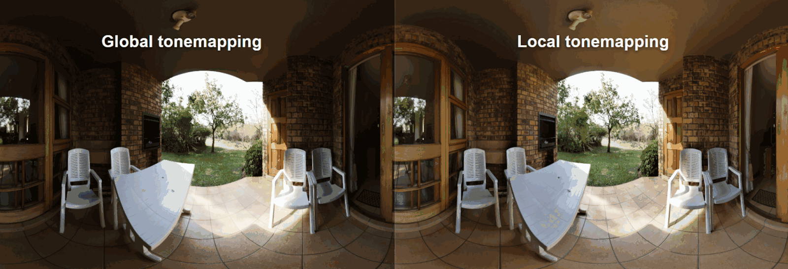
Local tonemapping in action. HDRI texture credit: Greg Zaal, CC0.
局部色调映射实际效果展示。HDRI 纹理来源:Greg Zaal, CC0。
In this post I want to close the loop and come back to the topic I described ~6y ago!
在这篇文章中,我想回到大约 6 年前我描述过的那个话题,把整个环闭合起来!
Local tonemapping (I’ll refer to it as LTM) - a component I considered a missing piece in video games rendering, especially with physically-based pipelines and using real/physical sky/sun models.
局部色调映射(以下简称 LTM)—— 我认为这是游戏渲染中缺失的一块拼图,尤其是在使用基于物理的管线和真实物理天空/太阳模型时。
Global tonemapping is not enough for casual photography (where we don’t control the lighting), and while games can “hack” things, I considered LTM an almost a must have tool that can be used in some cases.
全局色调映射对于日常摄影来说是不够的(我们无法控制光照),虽然游戏可以通过各种 “hack” 来解决,但我认为 LTM 几乎是一个必备工具,至少在某些情况下必须使用。
I have described a simple hacked solution that I implemented for God of War, but I was never happy with it - it helped in some scenes, but pushing it caused all kinds of ugly halo artifacts:
我曾描述过一个为《战神》实现的简单 hack 方案,但我对它从来不满意 —— 它在某些场景中有帮助,但一旦加大力度就会产生各种难看的光晕伪影:
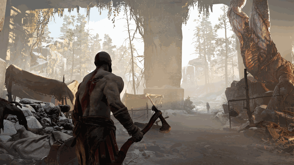
Local tonemapping as used in God of War.
《战神》中使用的局部色调映射。
Later I remember discussions on twitter about using “bilateral grid” (really influential older work from my ex colleague Jiawen “Kevin” Chen) to prevent some halos, and last year Jasmin Patry gave an amazing presentation about tonemapping, color, and many other topics in “Ghost of Tsushima” that uses a mix of bilateral grid and Gaussian blurs. I’ll get back to it later.
后来我记得在 Twitter 上有人讨论使用”双边网格”(bilateral grid)来避免一些光晕——这是我前同事 Jiawen “Kevin” Chen 的一项极具影响力的早期工作。去年 Jasmin Patry 做了一个精彩的演讲,介绍了《对马岛之魂》中关于色调映射、颜色等多个主题,其中使用了双边网格和高斯模糊的混合方案。我稍后会再回来讨论它。
What I didn’t know when I originally wrote my post was that a year later, I would join Google, and work with some of the best image processing scientists and engineers on HDR+ - computational photography pipeline that includes many components, but one of the key signature ones is local tonemapping - the magic behind “HDR+ look” that is praised by both the reviewers and users.
当我最初写那篇文章时,我不知道一年后我会加入 Google,与一些最优秀的图像处理科学家和工程师一起研发 HDR+ —— 一个包含许多组件的计算摄影管线,其中一个关键标志性组件就是局部色调映射 —— 这是被评测者和用户广泛称赞的”HDR+ 风格”背后的魔法。
The LTM solution is a fairly advanced pipeline, the result of the labor and love of my colleague Ryan (you might know his early graphics work if you ever used Winamp!) with excellent engineering, ideas, and endless patience for tweaks and tunings - a true “secret sauce”.
这个 LTM 解决方案是一个相当先进的管线,是我同事 Ryan(如果你用过 Winamp,可能知道他早期的图形工作!)倾注心血的成果——出色的工程实现、巧妙的想法,以及对调优无尽的耐心——真正的”秘方”。
But the original inspiration and the core skeleton is a fairly simple algorithm, “Exposure Fusion”, which can both deliver excellent results, as well as be implemented very easily - and I’m going to cover it and discuss its use for real time rendering.
但最初的灵感和核心骨架是一个相当简单的算法——”Exposure Fusion”(曝光融合),它既能产出优秀的结果,又非常容易实现——我将在这里介绍它,并讨论其在实时渲染中的应用。
This post comes with a web demo in Javascript and obviously with source code. To be honest it was an excuse for me to learn some Javascript and WebGL (might write some quick “getting started” post about my experience), but I’m happy how it turned out.
本文附带一个 JavaScript 网页 Demo 以及 源代码。说实话,这也是我学习 JavaScript 和 WebGL 的一个借口(可能会写一篇快速”入门”帖子来分享我的经验),但我对最终效果很满意。
So, let’s jump in!
好,让我们开始吧!
Some disclaimers(一些声明)
In this post I will be using a HDRI by Greg Zaal.
本文中我将使用 Greg Zaal 制作的一张 HDRI。
Throughout the post I will be using ACES global tonemapper - I know it has a bad reputation (especially per-channel fits) and you might want to use something different, but its three js implementation is pretty good and has some of the proper desaturation properties. Important to note - in this post I don’t assume anything about the used global tonemapper and its curves or shapes - most will work as long as they reduce dynamic range. So in a way, this technique is orthogonal to the global tonemapping look and treatment of colors and tones.
整篇文章中我将使用 ACES 全局色调映射器 —— 我知道它名声不太好(尤其是逐通道拟合),你可能想用别的方案,但它的 three.js 实现相当不错,并且具有一些正确的去饱和属性。重要的是——本文不对所使用的全局色调映射器的曲线或形状做任何假设——只要能压缩动态范围,大多数都能工作。因此在某种程度上,这项技术与全局色调映射的外观和颜色/色调的处理是正交的。
Finally, I know how many - including myself - hate the “toxic HDR” look that was popular in the early noughties - and while it is possible to achieve it with the described method, it doesn’t have to be - this is a matter of tuning parameters.
最后,我知道很多人——包括我自己——讨厌 2000 年代初流行的”有毒 HDR“风格——虽然用本文描述的方法可以实现这种效果,但并非必须如此——这只是参数调优的问题。
Note that if you ever use Lightroom or Adobe Camera Raw to open RAW files in Photoshop, you are using a local tonemapper! Simply their implementation is very good and has subtle, reasonable defaults.
请注意,如果你曾经使用 Lightroom 或 Adobe Camera Raw 在 Photoshop 中打开 RAW 文件,你就在使用局部色调映射器!只不过他们的实现非常好,有着微妙、合理的默认值。
Localized exposure, local tonemapping - recap of the problem(局部曝光与局部色调映射——问题回顾)
In my old post, I went quite deep into why one might want to use a localized exposure / localized tonemapping solution. I encourage you to read it if you haven’t, but I’ll quickly summarize the problem here as well.
在我之前的旧文中,我深入探讨了为什么需要使用局部曝光/局部色调映射方案。如果你还没读过,我建议你去看看,但我也会在这里快速总结这个问题。
This problem occurs in photography, but we can look at it from a graphics perspective.
这个问题出现在摄影中,但我们可以从图形学的角度来看。
We render a scene with a physically correct pipeline, using physical values for lighting, and have an HDR representation of the scene. To display it, you need to adjust exposure and tonemap it.
我们用物理正确的管线渲染场景,使用物理值来表达光照,得到场景的 HDR 表示。要显示它,你需要调整曝光并进行色调映射。
If your scene has a lot of dynamic range (simplest case - a day scene with harsh sunlight and parts of the scene in shadows), picking the right exposure is challenging.
如果你的场景有很大的动态范围(最简单的情况——一个强烈阳光的白天场景,部分区域处于阴影中),选择正确的曝光是很有挑战性的。
If we pick a “medium” exposure, exposing for the midtones, we get something “reasonable”:
如果我们选择一个”中等”曝光,对中间调曝光,我们会得到一些”还行”的效果:
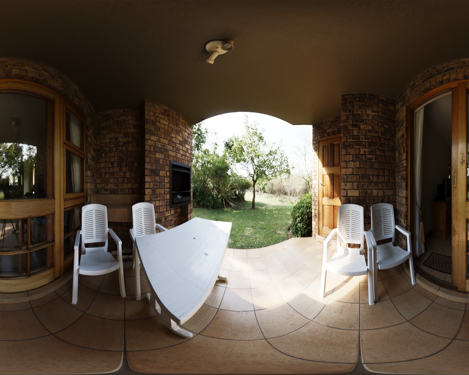
On the other hand, details in the sunlit areas are washed out and barely visible, and information in the shadows is completely dark and barely visible.
另一方面,阳光照射区域的细节被冲掉了,几乎不可见,而阴影中的信息完全是黑的,也几乎看不到。
You might want to render a scene like this - high contrast can be a desired outcome with some artistic intent. In some other cases it might not be - and this is especially important in video games that are not just pure art, but visuals need to serve gameplay and interactive purposes - very often, you cannot have important detail not visible.
你可能想要渲染这样的高对比度场景——这可能是某种艺术意图下的期望效果。但在其他情况下可能不是——这在游戏中尤为重要,因为游戏不只是纯粹的艺术,视觉效果需要服务于玩法和交互目的——很多时候,你不能让重要的细节不可见。
If we try to reduce the contrast, we can start seeing all the details, but everything looks washed out and ugly:
如果我们尝试降低对比度,我们可以开始看到所有细节,但一切看起来发白且难看:
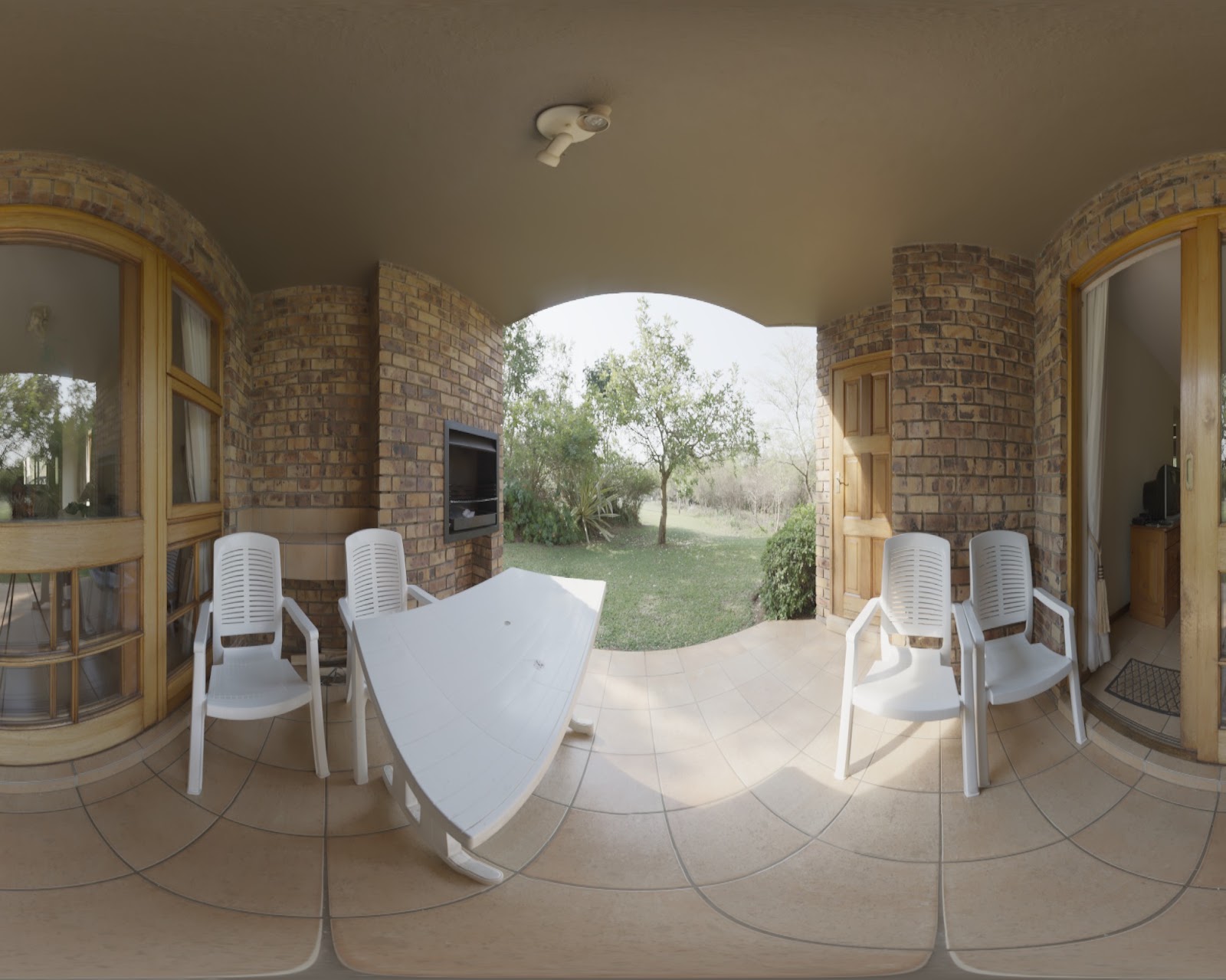
We want to keep the original, punchy look, but still be able to see all the relevant details. How can we do that?
我们想保持原始的、有冲击力的外观,但仍然能看到所有相关细节。怎么做到呢?
Let’s get back to selecting the exposure - here are three different exposures:
让我们回到曝光选择——这里是三种不同的曝光:
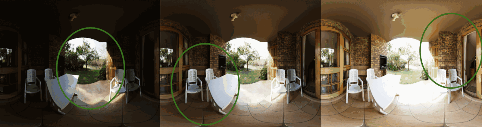
None of them is perfect when it comes to representing all details in the scene, but each one of them produces a clear, pleasant look in a certain area.
没有哪一个在表现场景所有细节方面是完美的,但每一个都在特定区域产生了清晰、令人愉悦的效果。
I have marked it with a green circle area “properly exposed” regions - where we can see all the details. Locally, in those regions, those images look perfect for our intent - and we are going to produce a single image that combines all of those.
我用绿色圆圈标记了”正确曝光”的区域——在这些区域我们可以看到所有细节。在局部,在那些区域内,这些图像看起来完美符合我们的意图——我们将生成一张组合所有这些的单一图像。
Alternative solutions(替代方案)
It’s worth mentioning how this problem can be solved in other ways.
值得一提的是这个问题还有其他解决方式。
My previous post described some solutions used in photography, filmography, and video games. Typically it involves either manually brightening/darkening some areas (famous Ansel Adams dodge/burn aspects of the zone system), but it can start much earlier, before taking the picture - by inserting artificial lights that reduce contrast of the scene, tarps, reflectors, diffusers.
我之前的文章描述了摄影、电影和游戏中使用的一些方案。通常涉及手动提亮/压暗某些区域(著名的 Ansel Adams 区域系统中的减淡/加深技术),但也可以在拍照前更早开始——通过插入人工光源来降低场景对比度,或使用篷布、反射板、柔光板等。
In video games it is way easier to “fake” it, and break all physicality completely - from lights through materials to post fx - and while it’s an useful tool, it reduces the ease and potential of using physical consistency and ability to use references and real life models. Once you hack your sky lighting model, the sun or artificial lights at sunset will not look correctly…
在游戏中”作假”要容易得多,可以完全打破所有物理性 —— 从光源到材质再到后处理——虽然这是一个有用的工具,但它降低了使用物理一致性的便利性和潜力,以及使用参考和现实模型的能力。一旦你 hack 了天空光照模型,日落时的太阳或人工灯光就不会看起来正确了……
Or you could brighten the character albedos - but then the character art director will be upset that their characters might be visible, but look too chalky and have no proper rim specular. (Yes, this is a real anecdote from my working experience.)
或者你可以提亮角色 albedo —— 但这样角色美术总监就会不高兴了,因为角色虽然可见了,但看起来太粉白,没有合适的边缘高光。(是的,这是我工作经历中的真实故事。)
In practice you want to do as much as you can for artistic purposes - fill lights and character lights are amazing tools for shaping and conveying the mood of the scene. You don’t want to waste those, their artistic expressive power, and performance budgets to “fight” with the tonemapper…
实际上你想尽可能多地为艺术目的服务——补光和角色光是塑造和传达场景氛围的绝佳工具。你不想浪费这些工具、它们的艺术表现力和性能预算来与色调映射器”对抗”……
Blending exposures(混合曝光)
So we have three exposures - and we’d want to blend them, deciding per region which exposure to take.
所以我们有三种曝光——我们想混合它们,按区域决定取用哪个曝光。
There are a few ways to go about it, let’s go through them and some of their problems.
有几种方法可以做到这一点,让我们逐一介绍它们和各自的问题。
Per-pixel blending(逐像素混合)
The simplest option is very simple indeed - just deciding per pixel how to blend the three exposures depending on how well exposed they are.
最简单的选项确实很简单——只是逐像素根据曝光程度来决定如何混合三种曝光。
This doesn’t work very well:
这效果不太好:
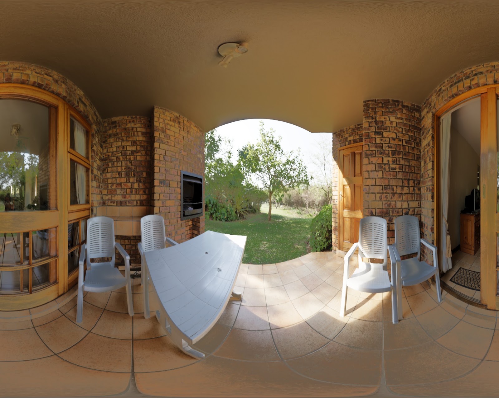
Ok, I take it even further - this is super ugly!
好吧,我说得更直接一点——这超级丑!
Everything looks washed out and weirdly saturated. It resembles a lot of the “toxic HDR” look mixed with washed out low contrast.
一切看起来发白且饱和度怪异。它很像”有毒 HDR”风格与冲淡低对比度的混合。
The problem is that even a dark region might have some bright pixels - and if we bring them down instead of up, it reduces the contrast.
问题在于,即使是暗区域也可能有一些亮像素——如果我们把它们压低而不是提亮,就会降低对比度。
Gaussian blending(高斯混合)
The second alternative is simple - blurring the pixel luminance (a lot!) before deciding on how to adjust the local exposure / which exposure to use.
第二种方案很简单——在决定如何调整局部曝光/使用哪种曝光之前,大量模糊像素亮度。
This is the approach I have described in my previous post and what we used for the God of War. And it can work “ok”, but generates pretty bad halos:
这是我在之前文章中描述的方法,也是我们在《战神》中使用的方法。它可以工作得”还行”,但会产生相当糟糕的光晕:
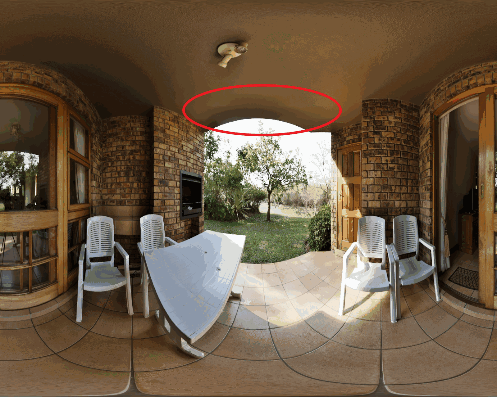
Bright regions trying to bring the dark ones down will leak onto medium exposure and dark regions, darkening them further and vice versa - dark regions strong influence will leak onto the surroundings. On a still image it can look acceptable, but with a video game moving camera it is visible and distracting…
亮区域试图把暗区域压低时会泄漏到中等曝光和暗区域上,使它们更暗,反之亦然——暗区域的强烈影响会泄漏到周围。在静态图像上可能看起来还行,但在游戏运动相机下会很明显且分散注意力……
Bilateral blending(双边混合)
Given that we would like to prevent bleeding over edges, one might try to use some form of edge-preserving or edge-stopping filter like bilateral. And it’s not a bad idea, but comes with some problems - gradient reversals and edge ringing.
既然我们想防止跨越边缘的泄漏,人们可能会尝试使用某种保边或停边滤波器,如双边滤波。这不是个坏主意,但会带来一些问题——梯度反转和边缘振铃。
I will refer you here to the mentioned excellent Siggraph presentation by Jasmin Patry who has analyzed where those come from.
关于这些问题的来源分析,我推荐你去看之前提到的 Jasmin Patry 在 Siggraph 的精彩演讲。
In his Desmos calculator he demos the problem on a simple 1D edge:
在他的 Desmos 计算器中,他在一个简单的 1D 边缘上演示了这个问题:
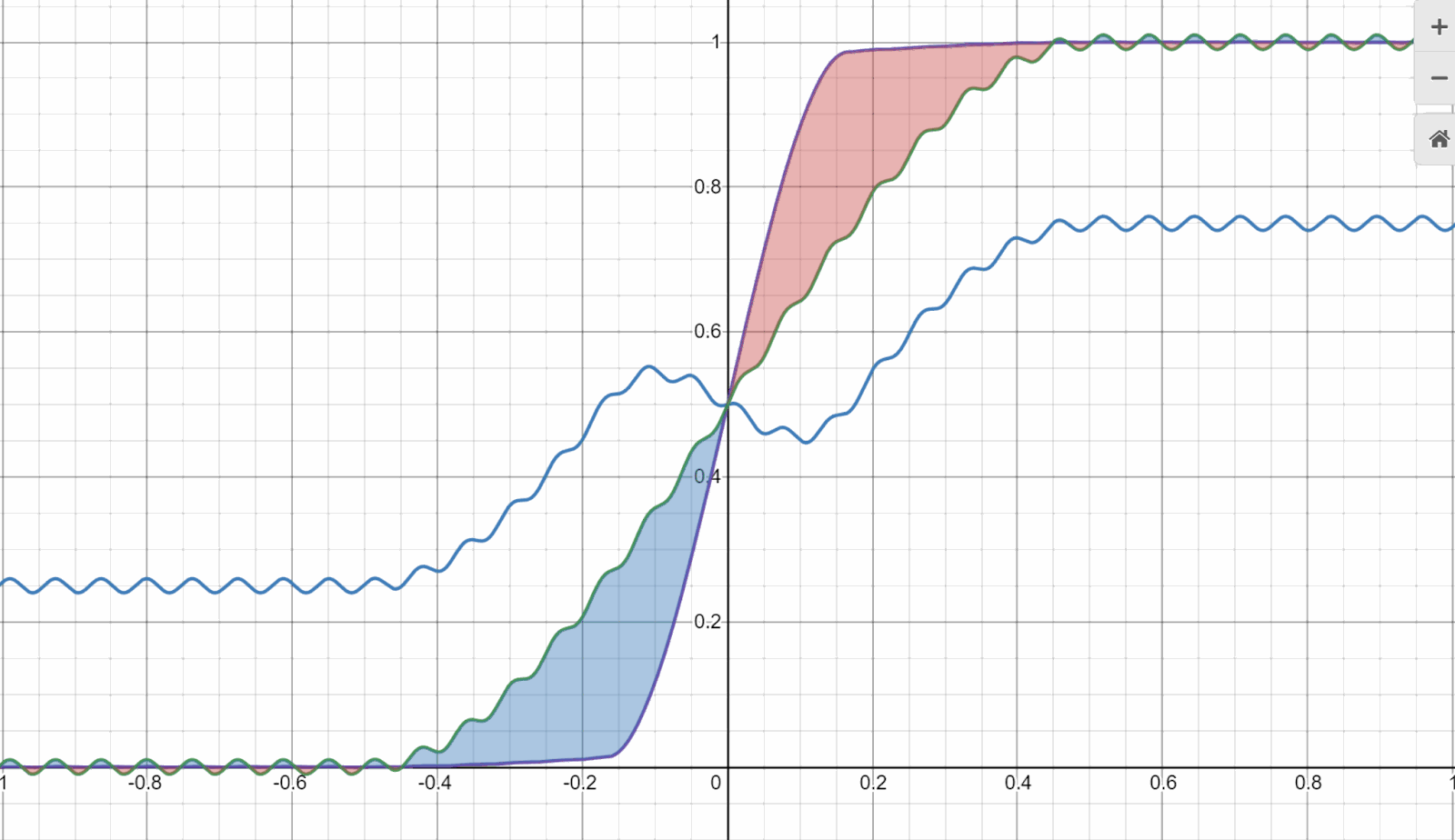
Source and credit: Desmos calculator by Jasmin Patry
来源与版权:Jasmin Patry 的 Desmos 计算器
His proposed solution to this problem (to blend bilateral with Gaussian) is great and offers a balance between halos and edge/gradient reversals and ringing that can occur with bilateral filters.
他提出的解决方案(将双边与高斯混合)很棒,在光晕和双边滤波可能产生的边缘/梯度反转及振铃之间提供了平衡。
But we can do even better and reduce the problem further through Exposure Fusion. But before we do, let’s look first however at a reasonable (but also flawed) alternative.
但我们可以做得更好,通过 Exposure Fusion 进一步减少问题。不过在此之前,让我们先看一个合理但也有缺陷的替代方案。
Guided filter blending(引导滤波混合)
A while ago, I wrote about the guided filter - how local linear models can be very useful and in some cases can work much better (and more efficiently!) than a joint bilateral filter.
不久前,我写过关于引导滤波的文章——局部线性模型如何非常有用,在某些情况下比联合双边滤波工作得更好(也更高效!)。
I’ll refer you to the post - and we will be actually using it later for speeding up the processing, so might be worth refreshing.
我推荐你去看那篇文章——我们后面实际上会用到它来加速处理,所以值得复习一下。
If we try to use a guided filter to transfer exposure information from low resolution / blurry image with blended exposure to full resolution, we end up with a result like this:
如果我们尝试使用引导滤波将曝光信息从低分辨率/模糊的混合曝光图像传递到全分辨率,我们会得到这样的结果:
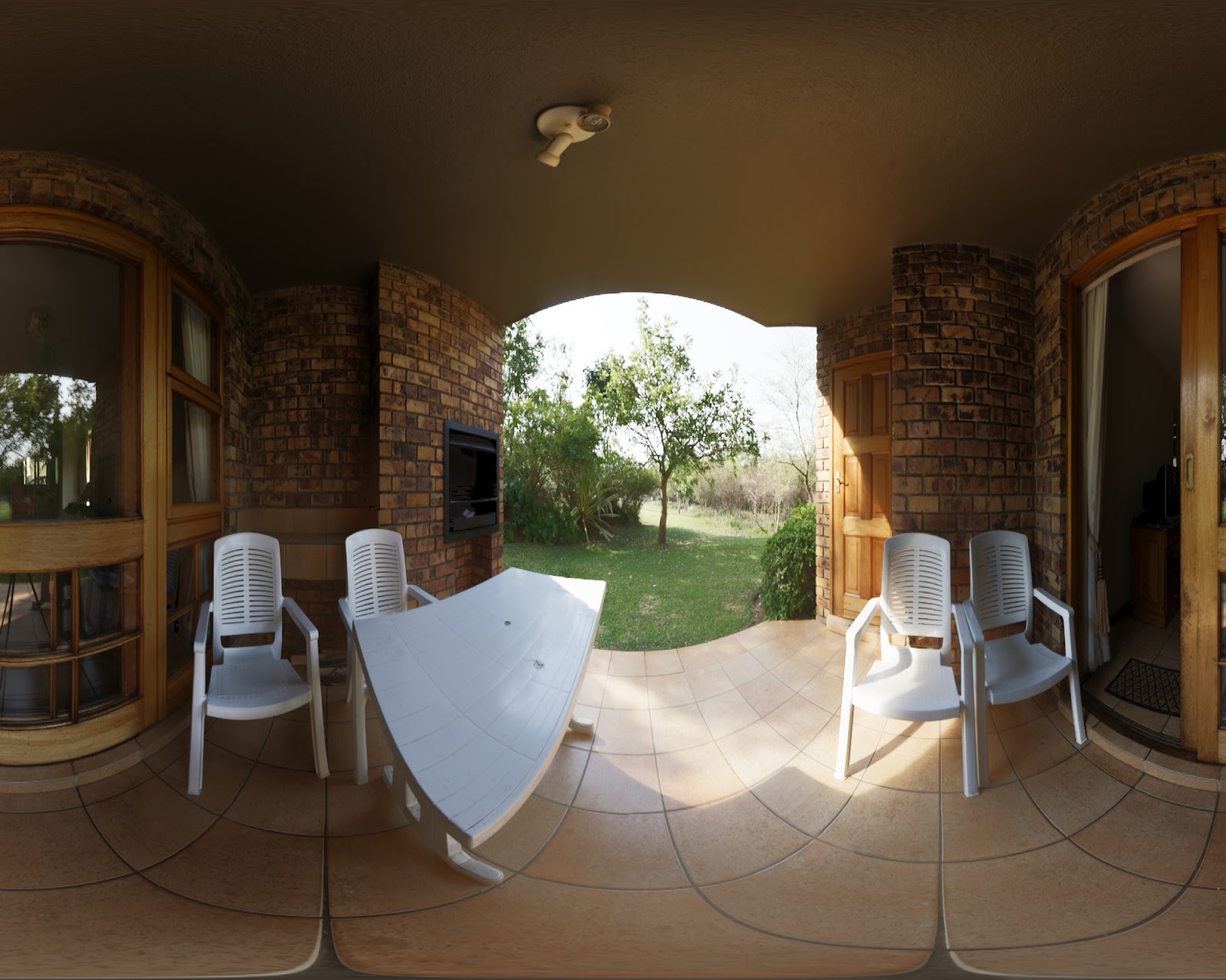
It’s actually not too bad, but notice that it tends to blur out some edges and reduce the local contrast as compared to the exposure fusion technique we’re going to have a look at next:
实际上还不错,但注意它倾向于模糊一些边缘并降低局部对比度,与我们接下来要看的 Exposure Fusion 技术相比:
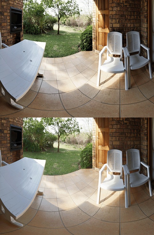
Guided upsampling of low resolution exposure data (“foggy” one) vs the exposure fusion algorithm (one with contrasty shadows).
低分辨率曝光数据的引导上采样(”雾蒙蒙”的那个)vs Exposure Fusion 算法(阴影有对比度的那个)。
Exposure fusion(曝光融合)
“Exposure fusion” by Mertens et al attempts to solve blending multiple globally tonemapped exposures (can be “synthetic” in the case of rendering), but in a way that preserves detail, edges, and minimizes halos.
Mertens 等人提出的”Exposure Fusion”试图解决混合多个全局色调映射曝光(在渲染的情况下可以是”合成”的)的问题,但以保留细节、边缘并最小化光晕的方式。
It starts with an observation that depending on the region of the image and presence of details, sometimes you want to have a wide blending radius, sometimes very sharp.
它从一个观察开始:根据图像区域和细节的存在情况,有时你想要宽的混合半径,有时则需要非常锐利。
Anytime you have a sharp edge - you want your blending to happen over a small area to avoid a halo. Anytime you have a relatively flat region - you want blending to happen over a large area, smoothen and be imperceptible.
任何时候有锐利边缘——你希望混合在小区域内发生以避免光晕。任何时候有相对平坦的区域——你希望混合在大区域内发生,平滑且不可察觉。
The way authors propose to achieve it is through blending different frequency information with a different radius.
作者提出的实现方式是通过对不同频率信息使用不同的混合半径。
This might be somewhat surprising and it’s hard to visualize, but let me attempt it. Here we change the exposure rapidly over a small horizontal line section:
这可能有些出人意料且难以可视化,但让我尝试一下。这里我们在一小段水平线上快速改变曝光:
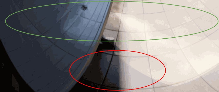
Notice how the change is not perceivable on the top of the image, this could be a normal picture, while on the bottom it is very harsh. Why? Because on top, the high frequency change correlates with high frequency information and image content change, while on the bottom it is applied to the low frequency information.
注意在图像顶部变化是不可感知的,这看起来可能就是一张正常图片,而在底部却非常刺眼。为什么?因为在顶部,高频变化与高频信息和图像内容变化相关联,而在底部它被应用到了低频信息上。
The key insight here is that you want frequency of the change to correlate with the frequency content of the image.
这里的关键洞察是:你希望变化的频率与图像内容的频率相关联。
On low frequency, flat regions, we are going to use a very wide blending radius. In areas with edges and textures, we are going to make it steeper and stop around them. Changes in brightness are hidden by the edges or alternatively, smoothened out over large edgeless regions!
在低频、平坦区域,我们将使用非常宽的混合半径。在有边缘和纹理的区域,我们将使其更陡峭并在它们周围停止。亮度变化被边缘隐藏,或者在大面积无边缘区域上被平滑掉!
Authors propose a simple approach: Construct Laplacian pyramids for each blended image - and blend those Laplacians. Laplacian blending radius is proportional to the Laplacian radius - and can be trivially constructed by creating a Gaussian pyramid of the weights.
作者提出了一个简单的方法:为每个混合图像构建拉普拉斯金字塔——然后混合这些拉普拉斯。拉普拉斯混合半径与拉普拉斯半径成正比——可以通过创建权重的高斯金字塔来简单构建。
Here is a figure from the paper that shows how simple (and brilliant) the idea is:
这是论文中的一张图,展示了这个想法有多简单(且精妙):
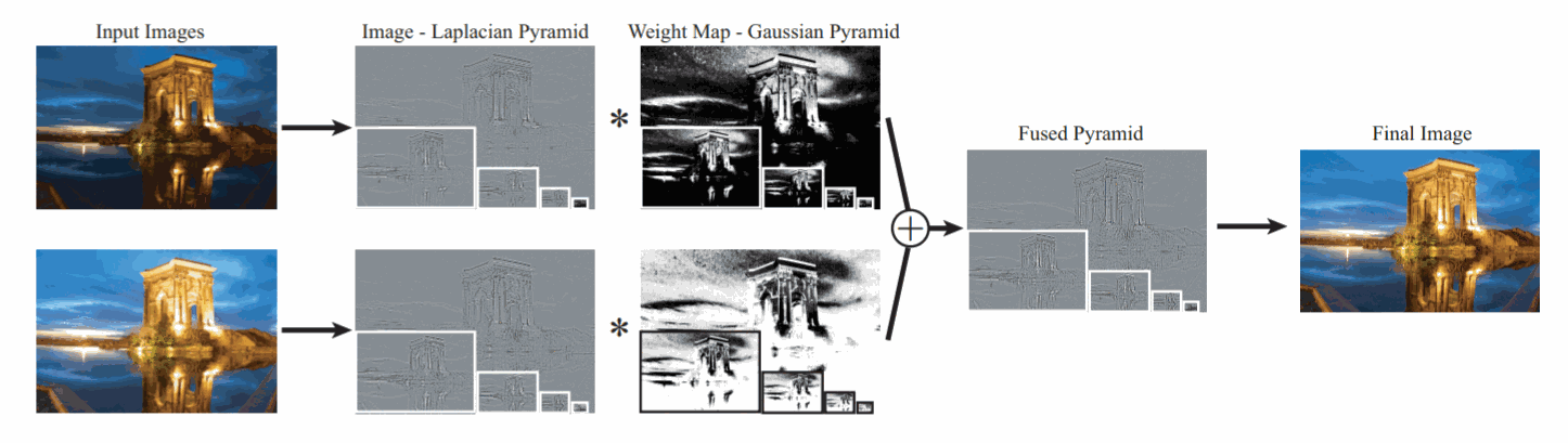
Image source and credit: “Exposure Fusion”, T.Mertens, J.Kautz, F.Van Reeth
图片来源与版权:”Exposure Fusion”, T.Mertens, J.Kautz, F.Van Reeth
I will describe later some GPU implementation details and parameters used how to make it behave well, but first let’s have a look at the results:
我稍后会描述一些 GPU 实现细节和如何使其表现良好的参数,但首先让我们看看结果:
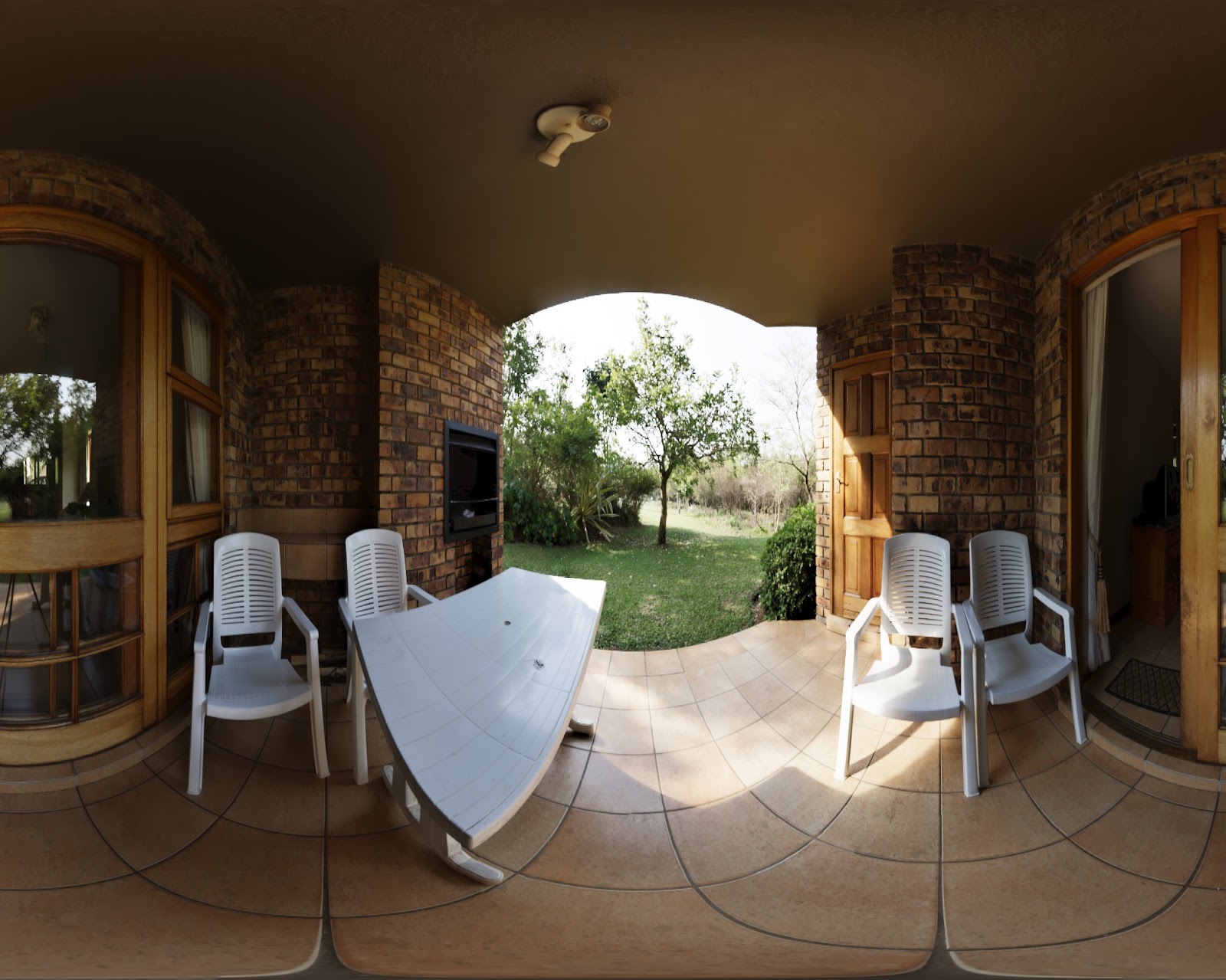
This looks really good! Contrasty, punchy look, details visible everywhere. Compared to the global tonemapping (apologies for GIF banding artifacts):
这看起来真的很好!有对比度、有冲击力的外观,细节到处可见。与全局色调映射对比(抱歉 GIF 的条带伪影):
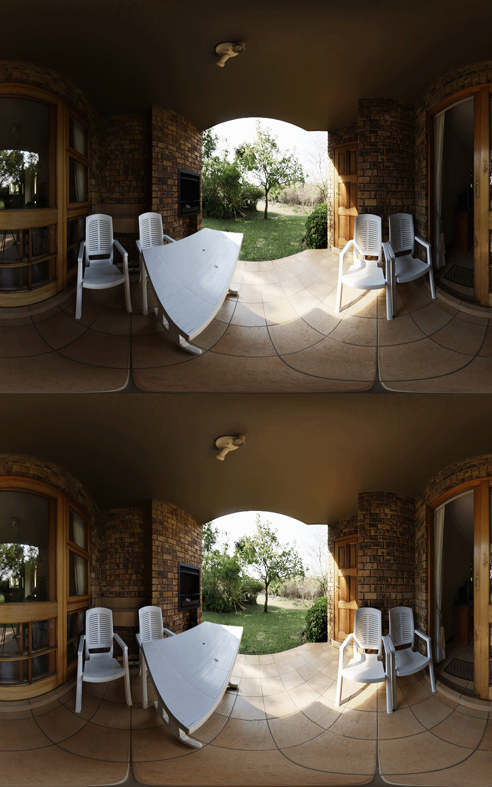
What I like about this picture is the lack of halos, lack of washout effect, proper local contrast, proper details, overall relatively subtle look. This might not be the look you’d want for that scene - obviously this is an artistic process - but it looks correct.
我喜欢这张图的地方是没有光晕、没有冲淡效果、适当的局部对比度、适当的细节、整体相对微妙的外观。这可能不是你想要的那个场景的效果——显然这是一个艺术过程——但它看起来是正确的。
Algorithm details(算法细节)
I highly encourage you to read the paper, but here is a short description of all of the steps:
我强烈建议你阅读论文,但这里是所有步骤的简短描述:
-
Create “synthetic exposures” by tonemapping your image with different exposure settings. In general the more - the better, but 3 are a pretty good starting choice, allowing for separate control of “shadows” and highlights.
-
创建”合成曝光”:用不同的曝光设置对图像进行色调映射。一般来说越多越好,但 3 种是一个很好的起始选择,允许分别控制”阴影”和高光。
-
Compute the “lightness” / “brightness” image from each synthetic exposure. Gamma-mapped luminance is an extremely crude and wrong approximation, but this is what I used in the demo to simplify it a lot.
-
从每个合成曝光计算”明度”/”亮度”图像。Gamma 映射的亮度是一个极其粗糙且错误的近似,但这是我在 Demo 中为了大幅简化而使用的方法。
-
Create a Laplacian pyramid of each lightness image up to some level - more about it later. This last level will be just Gaussian-blurred, low resolution version of the given exposure, all the other will be Laplacian - difference between two Gaussian levels.
-
为每个明度图像创建拉普拉斯金字塔直到某一层级 —— 稍后详述。最后一层将只是给定曝光的高斯模糊低分辨率版本,其他所有层级都是拉普拉斯——两个高斯层级之间的差。
-
Assign a per-pixel weight to each high resolution lightness image. Authors propose to use three metrics - contrast, saturation, and exposure - closeness to gray. In practice if you want to avoid some of the over-saturated, over-contrasty look, I recommend using just the exposure.
-
为每个高分辨率明度图像分配逐像素权重。作者建议使用三个指标——对比度、饱和度和曝光——接近灰色的程度。实际中如果你想避免过饱和、过对比的外观,我建议只使用曝光指标。
-
Create a Gaussian pyramid of the weights.
-
创建权重的高斯金字塔。
-
On some selected coarse level (like on the 5th or 6th mip-map), blend the coarsest Gaussian lightness mip-maps with the Gaussian weights.
-
在某个选定的粗糙层级上(如第 5 或第 6 个 mip-map),用高斯权重混合最粗糙的高斯明度 mip-map。
-
Go towards the finer pyramid levels / resolution - and on each level, blend Laplacians using a given level Gaussian and add it to the accumulated result.
-
向更精细的金字塔层级/分辨率走——在每个层级上,用该层级的高斯权重混合拉普拉斯并加到累积结果上。
-
Transfer the lightness to the full target image and do the rest of your tonemapping and color grading shenanigans.
-
将明度传递到完整目标图像,并完成其余的色调映射和调色操作。
Voila! We have an image in which edges (Laplacians) are blended at different scales with different radii.
完成!我们得到了一张图像,其中边缘(拉普拉斯)在不同尺度上以不同半径混合。
In practice, getting this algorithm to look very well in multiple conditions (it has some unintuitive behaviors) requires some tricks and some tuning - but in a nutshell it’s very simple!
实际上,让这个算法在多种条件下表现良好(它有一些反直觉的行为)需要一些技巧和调优——但简而言之它非常简单!
Optional – local contrast boost(可选——局部对比度增强)
One interesting option that the algorithm gives us is to boost the local contrast. It can be done in a few ways, but one that is pretty subtle and I like is to include the Laplacian magnitudes when deciding on the blending weights. Our effective weight will be Gaussian of the per-pixel weights times the absolute value of the magnitude. Note that generally this again is done per scale – so each scale weight is picked separately.
算法给我们的一个有趣选项是增强局部对比度。有几种方法可以做到,但一个我喜欢且比较微妙的方式是在决定混合权重时包含拉普拉斯幅度。我们的有效权重将是逐像素权重的高斯乘以幅度的绝对值。注意这通常也是按尺度进行的——所以每个尺度的权重是分别选取的。
Produced local contrast boost can be visually pleasing:
产生的局部对比度增强在视觉上令人愉悦:
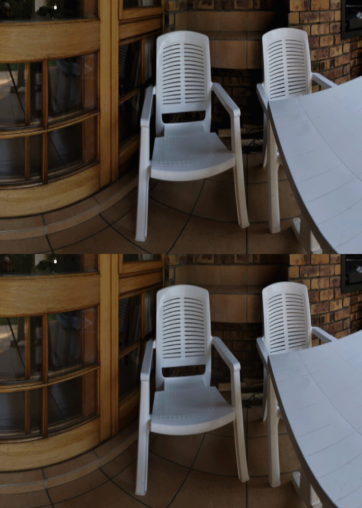
It actually reduces some of the “flat” look that every LTM operator can produce when pushed to the extreme.
它实际上减少了每个 LTM 算子在被推到极端时可能产生的”平坦”外观。
If you are a Lightroom user, their “Clarity” slider has a very similar effect and while the algorithm is proprietary (most likely a variant of “Local Laplacian Filter”), the general mechanism of action is very similar as well!
如果你是 Lightroom 用户,他们的 “Clarity”(清晰度)滑块 有非常相似的效果,虽然算法是专有的(最可能是”局部拉普拉斯滤波器”的变体),但总体作用机制也非常相似!
Extreme settings(极端设置)
I will describe algorithm / implementation parameters in the next section, but I couldn’t resist producing some “extreme toxic HDR” look as well – mostly to show that the algorithm is capable of doing so (if this is your aesthetic preference – and for some cases like architecture visualization it seems to be…).
我将在下一节描述算法/实现参数,但我忍不住也生成了一些”极端有毒 HDR”效果——主要是为了展示算法有能力做到这一点(如果这是你的审美偏好——对于建筑可视化等某些情况似乎确实如此……)。
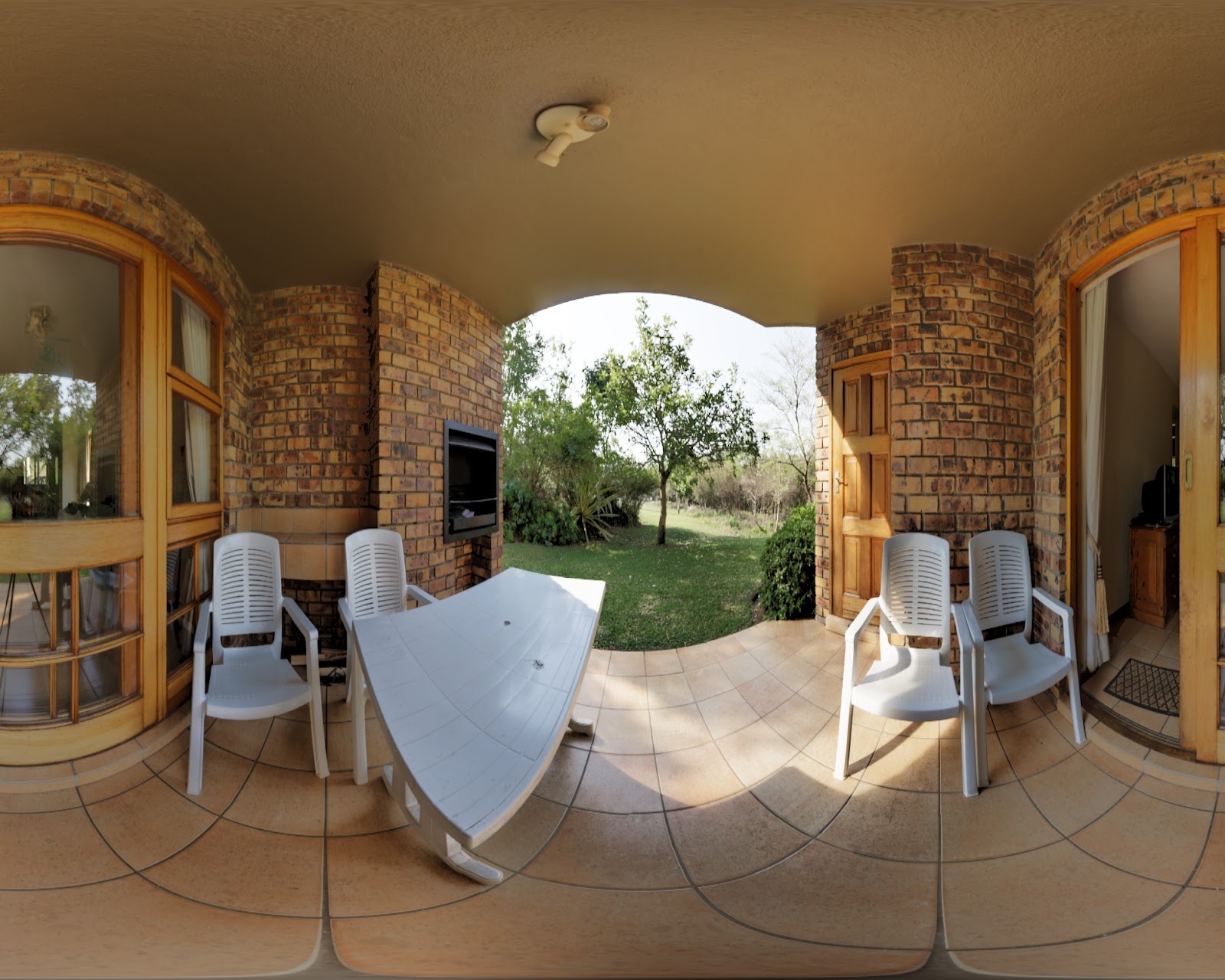
Not my look and definitely in artificial territories, but still, not too bad – there are some dark halos here and there, weird washouts, but the algorithm seems to perform reasonably well.
不是我的风格,肯定属于人造领地,但依然还不错——这里那里有些暗光晕、奇怪的冲淡,但算法似乎表现得相当好。
Parametrization(参数化)
Here are some of the algorithm parameters and the way I parametrized it.
这里是算法的一些参数以及我的参数化方式。
Exposure(曝光)
This one is the most straightforward. Exposure describes preferred overall average and “midtone” scene brightness.
这个最直接。曝光描述了偏好的整体平均和”中间调”场景亮度。
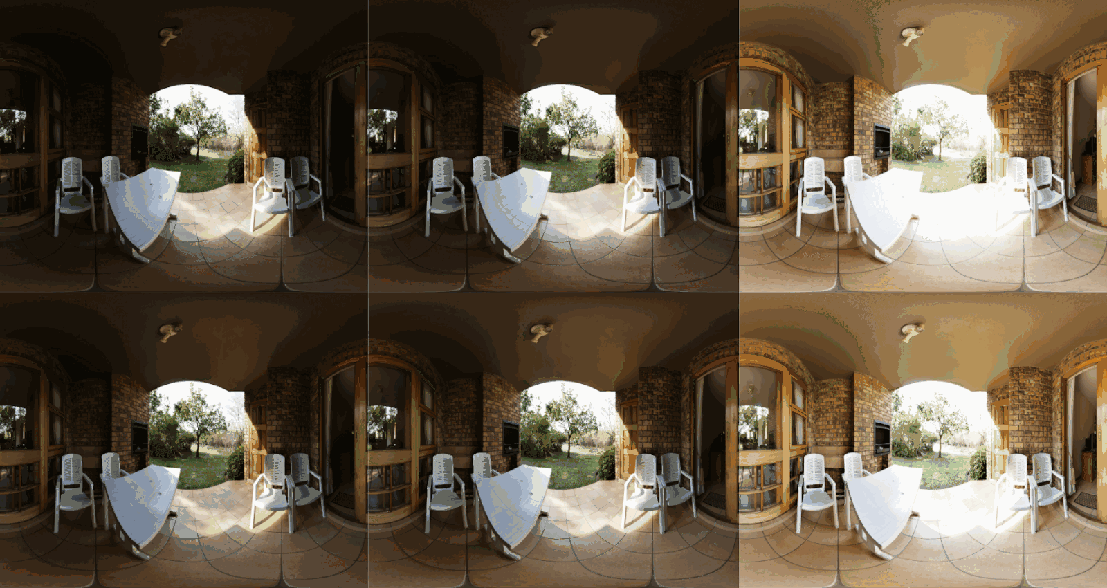
Here are three exposure levels (for comparison – top row is with LTM off and the bottom is on):
这里是三种曝光级别(对比——上面一行是 LTM 关闭,下面一行是开启):
Shadows and highlights(阴影与高光)
Shadows and highlights in my proposed parametrization describe how much to darken or brighten the synthetic exposures as compared to the global/middle exposure value.
在我提出的参数化方案中,阴影和高光描述了相对于全局/中间曝光值,合成曝光要加暗或提亮多少。
Here is the same image with the same exposure with left having the highest value of “shadows” (biggest exposure boost of the brightest image), center with both of them at 0, and the right with maximum “highlights”:
这里是同一张图像、同一曝光,左边阴影值最高(最亮图像的最大曝光提升),中间两者都为 0,右边高光最大:
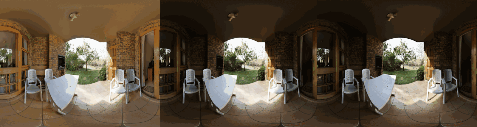
Those are extreme and not recommended values – but the concept of tuning separately shadows and highlights is very important for artistic control over the tonemapping. It is part of the image and the look, and should be decided with artistic intent and for the scene mood.
这些是极端且不推荐的值——但分别调整阴影和高光的概念对于色调映射的艺术控制非常重要。它是图像和外观的一部分,应该带着艺术意图并根据场景氛围来决定。
Coarsest mip level(最粗糙 mip 层级)
The final two important parameters are the most counter-intuitive.
最后两个重要参数是最反直觉的。
When we decide up to which level we’d want to construct the pyramids, we decide which frequencies will be blended together (anything at that mip level and above). Setting the mip level to 0 is equivalent to full per-pixel weights and blending. On the other hand, setting it to maximum blends each level as Laplacian.
当我们决定构建金字塔到哪个层级时,我们在决定哪些频率会被混合在一起(该 mip 层级及以上的所有内容)。将 mip 层级设为 0 等同于完整的逐像素权重和混合。另一方面,设为最大值则将每个层级都作为拉普拉斯混合。
The lower the coarsest level, the more dynamic range compression there is – but also more washed out, fake-HDR look.
最粗糙层级越低,动态范围压缩越多——但也越冲淡、越假 HDR 的外观。
Here are mip levels 0, 5, 9:
这里是 mip 层级 0、5、9:
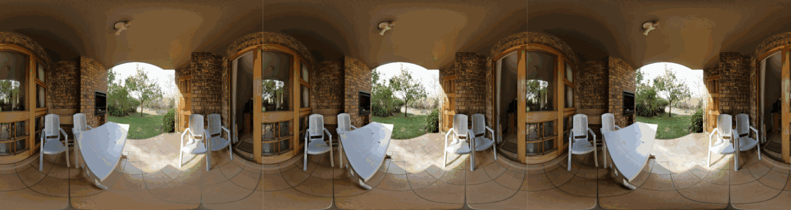
Thing to notice is the increasing amount of local contrast (see for example the floor, especially close to table leg). The leftmost picture lacks some local contrast and gets washed out, but has the most dynamic range compression.
需要注意的是局部对比度在增加(例如看地板,尤其是桌腿附近)。最左边的图片缺少一些局部对比度并被冲淡,但具有最多的动态范围压缩。
This might not be very clear, so I recommend you play with it in the demo to build some intuition.
这可能不太直观,所以我建议你在 Demo 中自己试试来建立一些直觉。
Exposure preference sigma(曝光偏好 sigma)
This is the final parameter – it describes how “strong” the weighting preference is based on closeness of the lightness to 0.5. It affects the overall strength of the effect – with zero providing almost no LTM (all exposure weights are the same!), and with extreme settings producing artifacts and overcompressed look (pixels getting contribution only from a single exposure with some discontinuities):
这是最后一个参数——它描述了基于明度接近 0.5 的程度的加权偏好有多”强”。它影响效果的整体强度——为零时几乎不提供 LTM(所有曝光权重相同!),极端设置时会产生伪影和过度压缩的外观(像素只从单一曝光获得贡献,且有一些不连续性):
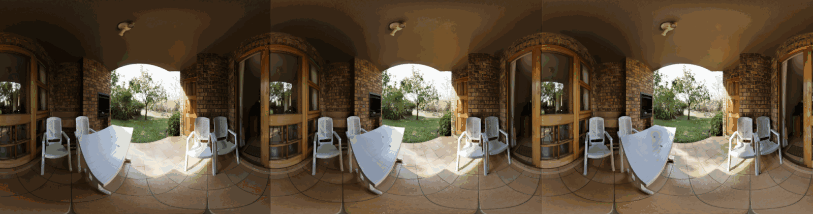
(Notice the artifacts on the rightmost image on the table and when highlights blend with the midtones)
(注意最右边图像桌子上的伪影以及高光与中间调混合时的问题)
I again recommend you play with it yourself to build some intuition.
我再次建议你自己尝试来建立直觉。
Algorithm problems(算法问题)
Overall, I like the algorithm a lot and find it excellent and able to produce great results.
总体而言,我非常喜欢这个算法,觉得它很出色,能产出很好的结果。
The biggest problem is its counterintuitive behavior that depends on the image frequency content. Images with strong edges will compress differently, with a different look than images with weak edges. Even the frequency of detail (like fine scale – foliage vs medium scale like textures) matters and will affect the look. This is a problem as a certain value of “shadows” will brighten actual shadows of scenes differently depending on their contents. This is where artist control and tuning come into play. While there are many sweet spots, getting them perfectly right for every scenario (like casual smartphone photography) requires a lot of work. Luckily in games and adjusting it per scene it can be much easier.
最大的问题是其反直觉的行为取决于图像的频率内容。有强边缘的图像会产生不同的压缩效果,外观与弱边缘的图像不同。即使细节的频率(如细尺度——植被 vs 中等尺度如纹理)也会影响外观。这是一个问题,因为特定的”阴影”值会根据内容不同而不同地提亮场景的实际阴影。这就是艺术家控制和调优发挥作用的地方。虽然有很多甜蜜点,但为每个场景(如手机随手拍摄)找到完美设置需要大量工作。幸运的是在游戏中可以按场景调整,会容易得多。
The second issue is that when pushed to the extreme, the algorithm will produce artifacts. One way to get around it is to increase the number of the synthetic exposures, but this increases the cost.
第二个问题是当被推到极端时,算法会产生伪影。一种解决方法是增加合成曝光的数量,但这会增加成本。
Note that both of those problems don’t occur if you use it in a more “subtle” way, as a tool and in combination with other tools of the trade.
注意,如果你以更”微妙”的方式使用它,作为工具并与其他工具结合使用,这两个问题都不会发生。
Finally, the algorithm is designed for blending LDR exposures and producing an LDR image. I think it should work with HDR pipelines as well, but some modifications might be needed.
最后,该算法是为混合 LDR 曝光并产生 LDR 图像而设计的。我认为它应该也能用于 HDR 管线,但可能需要一些修改。
GPU implementation(GPU 实现)
The algorithm is very straightforward to implement on the GPU. See my 300loc implementation, where those 300 lines include GUI, loading etc!
该算法在 GPU 上实现非常直接。参见我的 300 行实现,其中这 300 行还包括 GUI、加载等!
All synthetic exposures can be packed together in a single texture. One doesn’t need to create Laplacian pyramids and allocate memory for them – they can be constructed as a difference between Gaussian pyramids mip-maps. Creation of pyramids can be as simple as creating mips, or as complicated and fast as using compute shaders to produce multiple levels in one pass.
所有合成曝光可以打包在一张纹理中。不需要创建拉普拉斯金字塔并为它们分配内存——它们可以构造为高斯金字塔 mip-map 之间的差。金字塔的创建可以简单到只是创建 mip,也可以复杂且高效到使用 compute shader 在一个 pass 中生成多个层级。
Note: I used the most simple bilinear downsampling and upsampling, which comes with some problems and would alias and flickered under motion. It also can produce diamond-shaped artifacts. In practice, I would suggest using a much better downsampling filter, and adjusting it for the upsampling operator. But for subtle settings this might not be necessary.
注意: 我使用了最简单的双线性下采样和上采样,这带来了一些问题,在运动时会产生锯齿和闪烁。它还可能产生菱形伪影。实际中,我建议使用更好的下采样滤波器,并为上采样算子调整它。但对于微妙的设置这可能不是必需的。
The biggest cost is in tonemapping the synthetic exposures (as expensive as your global tonemapping operator) – but one could use a simplified “proxy” operator – we care only about the correlation with the final lightness here.
最大的成本在于色调映射合成曝光(与你的全局色调映射算子一样昂贵)——但可以使用简化的”代理”算子——我们这里只关心与最终明度的相关性。
Other than this, every level is just a little bit of ALU and 3 texture fetches from very low resolution textures!
除此之外,每个层级只是一点 ALU 和从非常低分辨率纹理中进行 3 次纹理采样!
How fast is it? I don’t have a way to profile it now (coding on my laptop), but I believe that if implemented correctly, it should definitely be under 1ms on even previous generation consoles.
它有多快?我现在没法分析性能(在笔记本上编码),但我相信如果实现正确,即使在上一代主机上也肯定低于 1ms。
But… we can make it even faster and make most computations happen in low resolution!
但是……我们可以让它更快,让大部分计算在低分辨率下进行!
Guided upsampling(引导上采样)
While it is doable (and possibly not too expensive) to compute the exposure fusion in full resolution, why not just compute it at lower resolution and transfer the information to the full resolution image?
虽然在全分辨率下计算 Exposure Fusion 是可行的(可能也不太昂贵),但为什么不直接在低分辨率下计算然后将信息传递到全分辨率图像呢?
This is exactly the approach I used for HDR+ (there was a more advanced option of using Fast Bilateral Solver), and for the tonemapping (it was again a fairly complex and sophisticated variation of this simple algorithm, designed and implemented by my colleague Dillon Sharlet).
这正是我在 HDR+ 中使用的方法(有一个更高级的选项是使用 Fast Bilateral Solver),以及用于色调映射的方法(它又是这个简单算法的一个相当复杂和精细的变体,由我的同事 Dillon Sharlet 设计和实现)。
I’ll refer you to my guided filter post for the details, but so far every single result that I have shown in this post was produced in ¼ × ¼ resolution and guided upsampled!
详细内容我推荐你看我的引导滤波文章,但到目前为止我在本文中展示的每一个结果都是在 ¼ × ¼ 分辨率下生成并经过引导上采样的!
Here is a comparison of the computation at full, half, and quarter resolution, as a gif, as differences are impossible to see side-by-side:
这里是全分辨率、半分辨率和四分之一分辨率计算的对比,以 GIF 形式呈现,因为并排对比根本看不出差异:
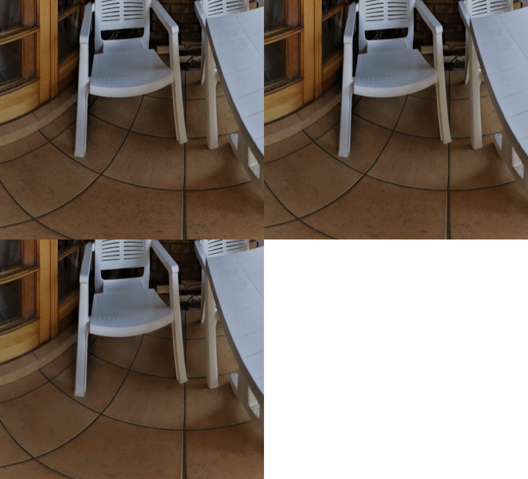
Animated GIF showing results computed at full, half, and quarter resolution. Differences are subtle, and mostly on the floor texture.
展示全分辨率、半分辨率和四分之一分辨率计算结果的动画 GIF。差异很微妙,主要在地板纹理上。
I also had to crop as otherwise the difference was not noticeable - you can see it on the ground texture (high frequency dots) as well as a subtle smudge artifact on the chair back.
我还不得不裁剪,否则差异根本不明显——你可以在地面纹理(高频点)上看到差异,以及椅背上一个微妙的涂抹伪影。
I encourage you to play with it in the demo app - you can adjust the “display_mip” parameter.
我鼓励你在 Demo 应用中自己尝试——你可以调整 “display_mip” 参数。
Summary(总结)
To conclude, in this post I came back to the topic of localized tonemapping, its general ideas and have described the “exposure fusion” algorithm with a simple, GPU friendly implementation - suitable for a simple WebGL demo (I release it to public domain, feel free to use or modify as much of it as you want).
总结一下,在本文中我回到了局部色调映射的话题,介绍了其基本思想,并描述了”Exposure Fusion”算法及其简单的、对 GPU 友好的实现——适合一个简单的 WebGL Demo(我将其发布到公共领域,随意使用或修改)。
It feels good to close the loop after 6y and knowing much more on the topic.
在 6 年后闭合这个环、并对这个话题了解了更多之后,感觉很好。
And a personal perspective - after those years, I am now even more convinced that having some LTM is a must as it’s an extremely invaluable tool. I hope this post convinced you so, and inspired you to experiment with it, and maybe implement it in your engine/game.
从个人角度来看——经过这些年,我现在更加确信拥有某种 LTM 是必须的,因为它是一个极其宝贵的工具。我希望这篇文章说服了你,并激励你去尝试它,也许在你的引擎/游戏中实现它。